A dataset with 2,185 CPUs and 2,668 GPUs to help researchers understand the development trend of CPUs and GPUs. Setup by Kaggle
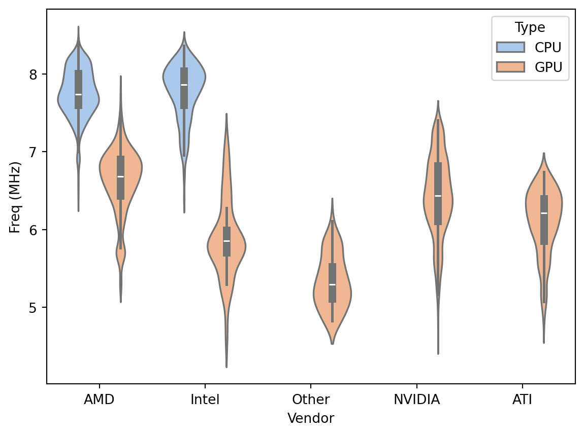
# library & datasetimport seaborn as snsimport pandas as pdimport numpy as npdf = pd.read_csv('images/chip_dataset.csv')print(df.head())sns.set_palette("pastel")sns.violinplot(x=df["Vendor"], y=np.log(df["Freq (MHz)"]), hue=df['Type'])
   Unnamed: 0                  Product Type Release Date  Process Size (nm)  \
0           0      AMD Athlon 64 3500+  CPU   2007-02-20               65.0
1           1         AMD Athlon 200GE  CPU   2018-09-06               14.0
2           2     Intel Core i5-1145G7  CPU   2020-09-02               10.0
3           3    Intel Xeon E5-2603 v2  CPU   2013-09-01               22.0
4           4  AMD Phenom II X4 980 BE  CPU   2011-05-03               45.0

   TDP (W)  Die Size (mm^2)  Transistors (million)  Freq (MHz)  Foundry  \
0     45.0             77.0                  122.0      2200.0  Unknown
1     35.0            192.0                 4800.0      3200.0  Unknown
2     28.0              NaN                    NaN      2600.0    Intel
3     80.0            160.0                 1400.0      1800.0    Intel
4    125.0            258.0                  758.0      3700.0  Unknown

  Vendor  FP16 GFLOPS  FP32 GFLOPS  FP64 GFLOPS
0    AMD          NaN          NaN          NaN
1    AMD          NaN          NaN          NaN
2  Intel          NaN          NaN          NaN
3  Intel          NaN          NaN          NaN
4    AMD          NaN          NaN          NaN
apply np.log to the Freq (MHz) column. Because of wide range of values
Set a pastel palette with sns.set_palette(“pastel”). These colors make it easier to see the parts of the violin plot
Hue Parameter: I’m using the hue parameter to differentiate between types of chips. Hue sets a color within the palette
Data Source and Preparation: Include a brief note on where the data comes from (you’ve provided a link, but a sentence or two summarizing the dataset would be helpful) and any preprocessing steps taken before visualization.
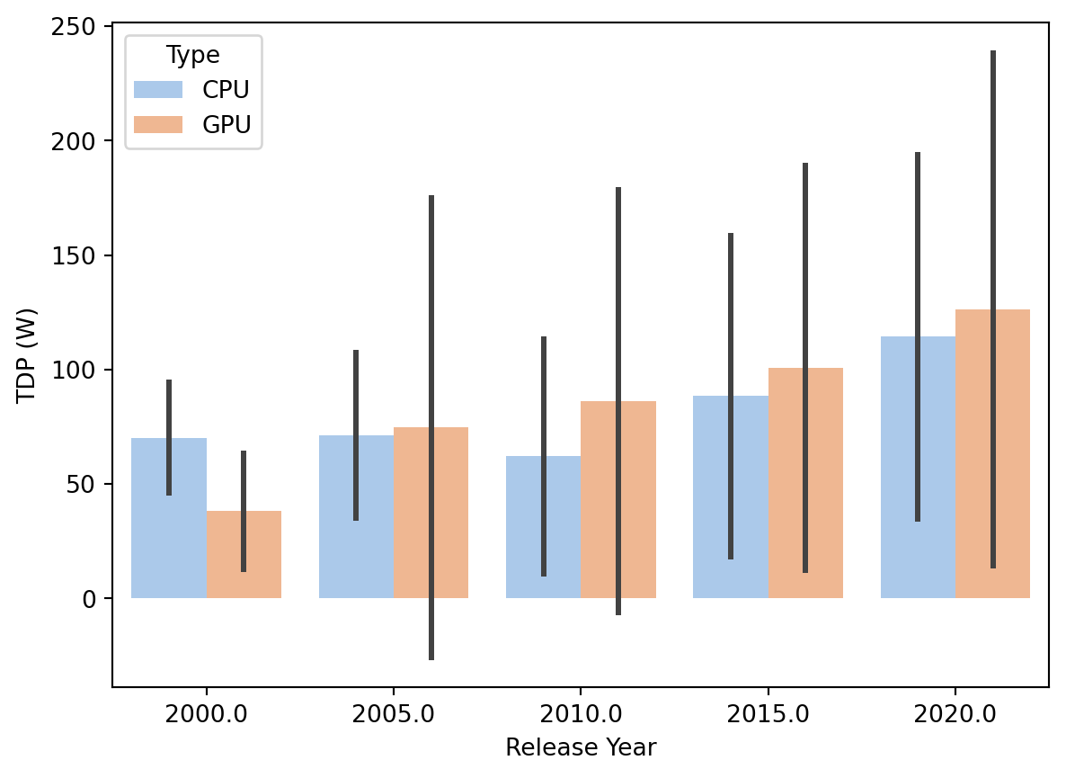
I might want to take date into account in these plots
A violin plot shows density curves. The width is the approximate frequency of data points at that value
Best for comparing distributions
consider ordering the groups
The details
the white dot represents the median
the thick gray bar in the center represents the inter-quartile range
the thin gray line represents the rest of the distribution, except for points that are determined to be “outliers” using a method that is a function of the inter-quartile range.
On each side of the gray line is a kernel density estimation to show the distribution shape of the data. Wider sections of the violin plot represent a higher probability that members of the population will take on the given value; the skinnier sections represent a lower probability.
error bars
print(df.describe())import pandas as pd# Assuming df is your DataFrame and 'Release Date' is the columndf['Release Date'] = pd.to_datetime(df['Release Date'], errors='coerce')df['Release Year'] = ((df['Release Date'].dt.year) //5) *5# Now df['Release Year'] contains the year extracted from 'Release Date'# plot a bar chartax = sns.barplot(x=df['Release Year'], y=df["TDP (W)"], hue =df['Type'], estimator=np.mean, errorbar=("sd"))